Veröffentlicht am Ein Kommentar

App Art: DECISION MAKER


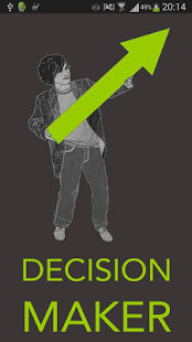
Der DECISION MAKER ist eine App, die ich zusammen mit Maggy Boehme, Christian Boehme und Daniel Kurzawe entwickelt habe und die sich als ein künstlerischer Beitrag in der vielfältigen Welt mobiler Applikationen versteht (siehe hierzu auch die Website von Goodthingy). Die App ist momentan für Android im Google Play Store zu erhalten, eine erweiterte Version für iOS ist in Arbeit.

Wir haben die App beim ZKM Karlsruhe zur Teilname am App Art Award 2014 eingereicht, aber leider nicht gewonnen. Bekanntlich zählt der olympische Gedanke und ich denke, dass diejenigen, die sich die Zeit nehmen, die App bei einem Spaziergang auszuprobieren, Erfahrungen machen, die einzigartig sind. Uns ist dies jedenfalls geglückt.

Welche Gedanken hinter der App stecken, lässt sich auf die simple Formel Entscheidungen quälen – Entscheidungen fordern heraus bringen, sind aber höchst komplex: Wo sind wir und wo wollen wir hin? Wie lässt sich eine Stadt erleben, wenn wir unsere Entscheidungen abgeben und ab wann widersetzt man sich seinem Souverän? Dieser Antagonismus, der Konflikt zwischen Folgsamkeit und Eigenwille, wird durch den DECISION MAKER verdeutlicht, doch auch persifliert.

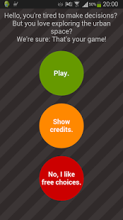
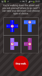
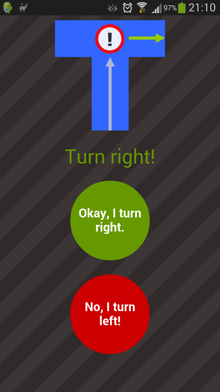
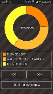
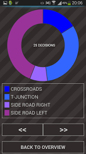
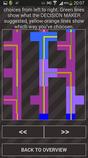
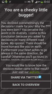
Der DECISION MAKER nimmt ‘wegweisende’ Entscheidungen ab, wie es üblich ist in einer technokratischen Welt. Man vertraut seiner Wahl oder zweifelt sie an. Doch diese Entscheidung muss der User bewusst treffen. An jedem Punkt des Weges, an jeder Gabelung steht es dem User frei eine Frage an den DECISION MAKER zu stellen. Dieser gibt Antwort und erwartet Folgsamkeit. Lehnt man seine Befehle ab, muss man mit einem bissigen Kommentar rechnen. Überhaupt quittiert der DECISION MAKER alles, was man tut, und wertet auf Grundlage des Entscheidungsverhaltens die Persönlichkeit des Users aus. Als Belohnung gibt er ihm, seinem Zögling, schließlich die Möglichkeit das Ergebnis in die große weite Netzwelt zu zwitschern.

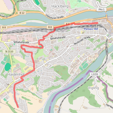
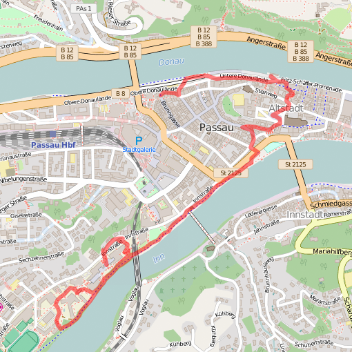
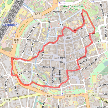
Nimmt man die Wegführung in Anspruch, ermöglicht das eine Erkundung des urbanen Raumes fernab von gewohnten Trampelpfaden. Zugleich eröffnet eine totale Hingabe einen neuen Blick nicht nur auf die Umgebung des Flaneurs, sondern vor allem auch auf ihn selbst. Mag es anfangs noch leicht oder sogar angenehm sein, seine Entscheidungen an den elektronischen Begleiter abzugeben, wird dies von Entscheidung zu Entscheidung schwerer. Man merkt: Selbstaufgabe erfordert Disziplin.

Die App spielt mit klassischen Kontroversen zur Willensfreiheit, wie wir sie von H.G. Frankfurt kennen: Wer trifft bewusste Entscheidungen und aus welcher Perspektive sind diese wirklich frei? Beispiel: Wenn der DECISION MAKER dir einen Weg vorschlägt, den du selbst gehen wolltest, folgst du dann deinem freien Willen?


Screenshot1

Screenshot2

Screenshot3

Screenshot3b

Screenshot4

Screenshot5

Screenshot6

Screenshot7

Veröffentlicht am Schreib einen Kommentar

Smaragdisierung

Hier kommt nun die Fortsetzung des Blogbeitrages Kristallbild. Ausgehend von konkret und materiell vorliegenden Buchseiten, sind vier Kristallzeichnungen entstanden. Da Deleuze an einer Stelle von Smaragden spricht, von grünen Kristallen, habe ich die entstandenen Kristallzeichnungen grün eingefärbt. Fertig ist das Experiment!

Deleuze_Kristalle_Seite 96_grün_Web

Deleuze_Kristalle_Seite 99_grün_Web

Deleuze_Kristalle_Seite 103_grün_Web

Deleuze_Kristalle_Seite 104_grün_Web

Veröffentlicht am Schreib einen Kommentar

Kristallbild

Langweilige Zugfahrten bringen es manchmal mit sich, dass man auf (gute) Ideen kommt. Letztens hatte ich mein Skizzenbuch dabei, doch spannende Motive waren nicht in Sicht, so dass ich damit anfing vor mich hin zu kritzeln. Ich zeichnete Punkte, verband sie mit Linien, versuchte die entstandene Fläche dreidimensional darzustellen und fand schließlich zu einem systematischen Verfahren, um kristallin aussehende Formen entstehen zu lassen. Nachdem ich das Prinzip x-mal durchgespielt habe, hat es mich gestört, dass ich die Punkte, die zu Beginn eines jeden Kristalls stehen, beliebig setze, ihre Anordnung zufällig ist. Wäre es nicht interessanter, wenn sie durch irgendetwas vorgegeben wären? Dieses irgendetwas war schnell gefunden: Betrachtet man eine Buchseite und markiert bestimmte Wörter, dann erhält man gewissermaßen solche Ausgangspunkte. Musste also nur noch ein Buch her, das sich mit Kristallen beschäftigt, so dass nicht nur eine rein formale, sondern eine semantisch aufgeladene Bild-Text-Relation entsteht. Chemie? Nein, Deleuze!

Gilles Deleuze, ein moderner Klassiker. In seinem Buch Das Zeit-Bild. Kino 2 (dt. 1997, orig. 1985) prägt er den Begriff des Kristallbildes. Dieser besonderen Form des Zeit-Bildes widmet er sein viertes Kapitel. Ich habe mir hier das erste Unterkapitel vorgenommen und alle Wörter markiert, die mit Kristallen zu tun haben (Kristallbild, kristallin, kristallisieren etc.). In meiner Ausgabe (Suhrkamp) häufen sich derartige Wörter besonders auf den Seiten 96, 99, 103 und 104, weshalb ich beschlossen habe, diese Buchseiten zu kristallisieren. Ich habe Transparentpapier über die Seiten gelegt, und an Stelle jedes markierten Wortes einen Punkt gesetzt, die die Ausgangspunkte für die Zeichnung bilden. Entstanden sind vier verschiedene Kristalle, die in direkter Relation zum Text stehen.

Der erste Kristall zeigt das Verfahren, macht das Schema deutlich, aber auch, dass ausgehend von einer Grundform unzählige Variationen möglich sind, insofern zwar die Anzahl, aber nicht der Winkel und die Länge der abgehenden Striche vorgegeben sind. Zudem sind die vier Kristalle Handzeichnungen, keine lupenreinen Kristalle. Doch das steigert ihren Wert.

Deleuze_Kristalle_Seite 96_Stufe 0

Deleuze_Kristalle_Seite 96_Stufe 1

Deleuze_Kristalle_Seite 96_Stufe 2

Deleuze_Kristalle_Seite 96_Stufe 3

Deleuze_Kristalle_Seite 96_Stufe 4

Deleuze_Kristalle_Seite 96_Stufe 5

Deleuze_Kristalle_Seite 96_Stufe 6

Deleuze_Kristalle_Seite 96_Stufe 7

Deleuze_Kristalle_Seite 96_Stufe 8

Deleuze_Kristalle_Seite 99_Web

Deleuze_Kristalle_Seite 103_Web

Deleuze_Kristalle_Seite 104_Web

Veröffentlicht am Ein Kommentar

Gamsbart

Fest im kollektiven Gedächtnis verankert ist der Bayer mit seiner Lederhos’n und Gamsbart, auch wenn er in dieser Gestalt inzwischen eher selten und vorwiegend auf der Wies’n anzutreffen ist. Das Gamswild ist in den Alpen beheimatet und im Großen und Ganzen ziemlich bartlos. Die Gams, im Hochdeutschen bekannt als Gämse, besitzt also keinen Gamsbart – es sei denn, man setzt ihr einen Hut mit einem ebensolchen auf.

Gamsbart

Veröffentlicht am Schreib einen Kommentar

Eisvogel. Vogeleis.

Ich hatte Lust einen Eisvogel zu zeichnen, mit Aquarellbuntstift. Das Ergebnis sah ziemlich verlaufen aus, nicht unbedingt so, wie ich es mir vorgestellt hatte… doch wollte ich trotzdem etwas daraus machen. Aufgrund der kugeligen Figur des Vogels und der Tropfen, die ein wenig an geschmolzene Eiscreme erinnern, war das Wortspiel schnell gefunden. Guten Appetit!

Eisvogel_Vogeleis_Blog

Veröffentlicht am Schreib einen Kommentar

Zeitungsente

In german language a newspaper hoax is called „Zeitungsente“ (newspaper duck). Referring to ORICRANE, Maggsti asked me to draw an ORIDUCK. I studied a lot of origami duck instructions to get a better understanding of the folding and folded some specimens by myself. I used an old newspaper because I didn’t want to waste good paper for that. In the end I got a newspaper duck and I was really happy about that great coincidence. I scanned the duck and added a too big head and slightly distorted feets. It’s nothing but a hoax.

Zeitungsente_klein

Veröffentlicht am Schreib einen Kommentar

ORICRANE

Metamorphosis is a topic which isn’t quite novel but one that never becomes boring. While trying to fold some origami animals (I totally failed), I had the idea to draw some of them instead and to let the abstract figure transform into a real life animal. For this I choose the crane, one of the most traditional origami animals. I did a lot of misshapen sketches before I could move on to the final drawing (see below). But in the end I got it. By the way: Cranes bring luck.

Kranich_Blog

Crane Sketches 01
Crane Sketches 02

Veröffentlicht am Schreib einen Kommentar

Visualizing PSYCHO*

In March 2013 I generated three short clips based on Hitchcock’s PSYCHO (1960): PSYCHOMEAN, PSYCHOMEDIAN and PSYCHOMODE (I labelled them PSYCHO*; have a closer look here). In a first step of this artistical research project I analyzed the mean, median and modal grey values of each frame of the famous shower sequence (5775 frames); in a second step I re-ordered all these frames in ascending order.

Visualisierung_klein

What I did today in the afternoon is much more unspectacular but gives surprising insight into the inner structure of the original montage as well the three different re-montages of the original image material. I put all frames together in one single image with help of ImageMontage, a plugin for ImageJ developed by Lev Manovich and his NY based team. As a result I got four visualizations that show each clip’s frames organized in a rectangular 2D grid. Great advantage of this kind of visualization is that you can catch the whole montage at a glance and grasp differences easily. See for yourself!

PSYCHO (ORIGINAL)
montage_DuscheOriginal_13350x7700_klein

PSYCHOMEAN
montage_DuscheMean_13350x7700_klein

PSYCHOMEDIAN
montage_DuscheMedian_13350x7700_klein

PSYCHOMODE
montage_DuscheModal_13350x7700_klein

Veröffentlicht am Schreib einen Kommentar

PATTERN WALK #3

Third walk. Passau again: I wasn’t hungry in the evening. So I decided to take a walk instead of going into a restaurant with other people. This time I started at Passau’s central station. Because of a turnaround just at the beginning, I didn’t walk straight into the old city center but in the west end of the city. It wasn’t that late in the evening but there wasn’t anybody around. That’s why I felt really uncomfortable after a while. But because I really wanted to fulfill the 20 iterations – my standard for a pattern walk since I reached my home on my first walk after 20 iterations again – I walked further on… and walked… and walked… However, as houses stopped to be on my right hand side and a field occurred instead of them I decided to stop my walk. Later on, back in the city, I joined my colleagues for a drink.

START: Passau, Central Station
PATTERN FOR THAT WALK: right, left (starting with right)
ITERATIONS: 12
DURATION: 1 hour 2 minutes
DISTANCE: 4,8 km
STOP: Dr.-Ritter-von-Scheuring-Straße 4, Passau-Haidenhof

Veröffentlicht am Schreib einen Kommentar

PATTERN WALK #2

Second walk. 2014 the first Dhd Conference took place in Passau: DARIAH-Pre-Conference and another three days full of interesting talks. But everybody needs a break at any time – so I do. I used my break for a inspiring pattern walk starting at the university area we met. My walk had some loops in the beginning because of the many small trails on the campus area and less possibilities to turn left because of the river on my left hand side. Around 30 minutes the situation twisted and I had to walk along the Inn with no possibilities to turn right. But in the end I reached the old city centre of Passau and stopped my walk after 20 iterations of my walking algorithm in Passau’s Bratfischwinkel. Why 20 iterations? Remember: That’s the number of iterations of my first walk in Göttingen which brought me back to my starting point.

START: Innstr. 27, Passau (bridge)
PATTERN FOR THAT WALK: right, left (starting with right)
ITERATIONS: 20
DURATION: 1 hour 8 minutes
DISTANCE: 3,6 km
STOP: Bratfischwinkel 12, Passau

Veröffentlicht am Schreib einen Kommentar

PATTERN WALK #1

It’s time to start a new art project: PATTERN WALKING. PATTERN WALKING has a double meaning: walking through a city entailing a specific rule or pattern on your walk and generating a pattern while doing this. It’s a project inspired by psychogeography explored by artists like Guy Debord in the 1950s or newer approaches of alternative ways of tourism, coming into vogue under the label experimental travel. It’s about exploring the urban space in an alternative way, discovering things you otherwise wouldn’t have discovered. Because of trail tracking apps that allow tracking your undertaken walk through the city of your choice, you explore the urban space twice: first while you’re walking using a particular rule like turning alternating right and left, second when you’re looking at the specific pattern of your walk on a map.

First walk. Starting at my front door, turning right, left, right, left… Scary experience: Walking through Göttingen following this simple rule, you won’t walk in a zig-zag-pattern transverse the city but in a loop. It’s true: Today Daniel and me started at Ritterplan 3 and ended up at Ritterplan 3 after 20 iterations of the chosen right-left-pattern for that first test walk.

START: Ritterplan 3, Göttingen
PATTERN FOR THAT WALK: right, left (starting with right)
ITERATIONS: 20
DURATION: 52 minutes
DISTANCE: 3,5 km
STOP: Ritterplan 3, Göttingen

Veröffentlicht am Schreib einen Kommentar

Treemaps and Art History?

Treemapping is a visualization method for displaying hierarchic structured data by using nested rectangles. This approach was firstly described in Ben Sheiderman’s essay Tree Visualization with Tree-Maps: 2-d Space-Filling Approach (1992) and offers a way not only visualizing the hierachic organised tree of data but also the content of his leaf nodes. In general, you can use treemaps as a visualization method for any kind of hierarchical data. However, if you google treemap, you’ll find a lot of treemaps showing economic data like stock prices. In this field Market Watch’s Map of the Market is a great example for the two dimensions visualized by every treemap: each rectangle’s size represents market cap and each rectangle’s color represents change in market cap.

Now I asked myself wheter that visualization method could be of interest for art history: In the last years news are over and over again about record breaking prices reached for an artwork at a public auction. Such high pricing strucks not only the old masters but also works for still living artists. As you might know the prices for young artist’s paintings are often assessed by canvas size. So the question for my use-case arises: Is there also a correlation between size and hammer price of famous artworks at auctions?

I took data of the art market in 2012 based on a survey of  Statista. Because one of the TOP 20 artworks in 2012 was Jeff Koon’s Tulips (1995-2004), a sculpture, I just took the TOP 19 artworks of 2012 for my treemap use-case. I used Treemap 4.1 developed by the University of Maryland (free for non-commerical use), put in my data structured in auction house, artist’s name, size and hammer price (-> price per square inch), and got the following treemap showing the relationship between hammer price and price per square inch:

TOP19_Zuschlagpreis_PreisproQuadratzentimeter
size: hammer price (the bigger the rectangele, the higher the price); color: price per square inch (blue: low price per square inch, red: high price per square inch)

What you can read out of that visualization is:

  • Edvard Munch’s The Scream (1885) was the artwork that reached the highest hammer price,
  • Raphael’s Head of a young Apostle (1520) reached the highest price per square inch, Munch’s The Scream the second highest price per square inch, Jackson Pollock’s Number 4 (1951) the third highest price per square inch,
  • and Sotheby’s sold the most upscaled artworks including Munch’s  The Scream, Raphael’s Head of a young Apostle and Jackson Pollock’s Number 4.

Conclusion: In 2012 a lot of artworks of still living artists reached high prices at public auctions. But putting the prices in relation to their size, you can see that age dominates over size. Hence, there seems not to exist a correlation between size and hammer price but rather between hammer price and date of origin.