Treemapping is a visualization method for displaying hierarchic structured data by using nested rectangles. This approach was firstly described in Ben Sheiderman’s essay Tree Visualization with Tree-Maps: 2-d Space-Filling Approach (1992) and offers a way not only visualizing the hierachic organised tree of data but also the content of his leaf nodes. In general, you can use treemaps as a visualization method for any kind of hierarchical data. However, if you google treemap, you’ll find a lot of treemaps showing economic data like stock prices. In this field Market Watch’s Map of the Market is a great example for the two dimensions visualized by every treemap: each rectangle’s size represents market cap and each rectangle’s color represents change in market cap.
Now I asked myself wheter that visualization method could be of interest for art history: In the last years news are over and over again about record breaking prices reached for an artwork at a public auction. Such high pricing strucks not only the old masters but also works for still living artists. As you might know the prices for young artist’s paintings are often assessed by canvas size. So the question for my use-case arises: Is there also a correlation between size and hammer price of famous artworks at auctions?
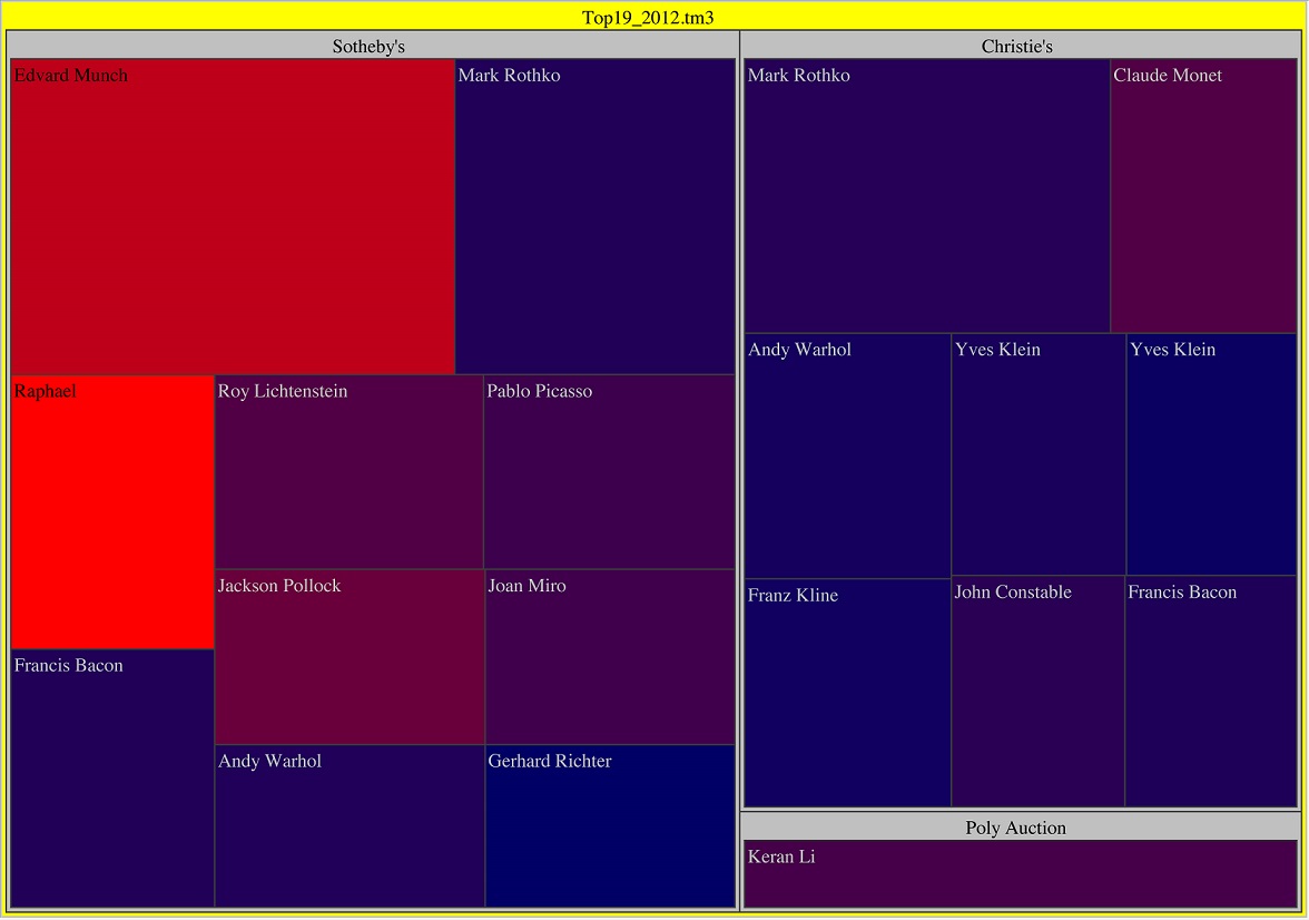
I took data of the art market in 2012 based on a survey of Statista. Because one of the TOP 20 artworks in 2012 was Jeff Koon’s Tulips (1995-2004), a sculpture, I just took the TOP 19 artworks of 2012 for my treemap use-case. I used Treemap 4.1 developed by the University of Maryland (free for non-commerical use), put in my data structured in auction house, artist’s name, size and hammer price (-> price per square inch), and got the following treemap showing the relationship between hammer price and price per square inch:

size: hammer price (the bigger the rectangele, the higher the price); color: price per square inch (blue: low price per square inch, red: high price per square inch)
What you can read out of that visualization is:
- Edvard Munch’s The Scream (1885) was the artwork that reached the highest hammer price,
- Raphael’s Head of a young Apostle (1520) reached the highest price per square inch, Munch’s The Scream the second highest price per square inch, Jackson Pollock’s Number 4 (1951) the third highest price per square inch,
- and Sotheby’s sold the most upscaled artworks including Munch’s The Scream, Raphael’s Head of a young Apostle and Jackson Pollock’s Number 4.
Conclusion: In 2012 a lot of artworks of still living artists reached high prices at public auctions. But putting the prices in relation to their size, you can see that age dominates over size. Hence, there seems not to exist a correlation between size and hammer price but rather between hammer price and date of origin.