ImagePlot is a visualization tool for exploring patterns in large image collections which is implemented as a macro that runs inside ImageJ (Image Processing and Analysis in Java). It has been devoloped by the Software Studies Initiative, a research lab founded and directed by Lev Manovich. On the lab’s website there are a lot of great examples about how to gain amazing results with that tool. For instance there is a project about comparing 128 paintings by Piet Mondrian with 123 paintings by Mark Rothko in terms of brightness and saturation mean, another aspiring one is about comparing one million manga pages. Inspired by such a kind of having a deeper look on art in a new way, commonly known as Cultural Analytics, I wondered if I could answer some of my research questions using that software tool.
Currently I’m writing on my PhD thesis about narrative in film and video installations. I’m most interested in multi screen installations, a special type of installations where artists arrange two or more screens within the gallery or museum space. To understand the specific opportunities of multiplying the projection screen for storytelling, I focus on possible graphic, syntactic and semantic relations between the single screens of a multi screen installation. Using ImagePlot I would expect to literally see some of the differences between the different screens of an installation.
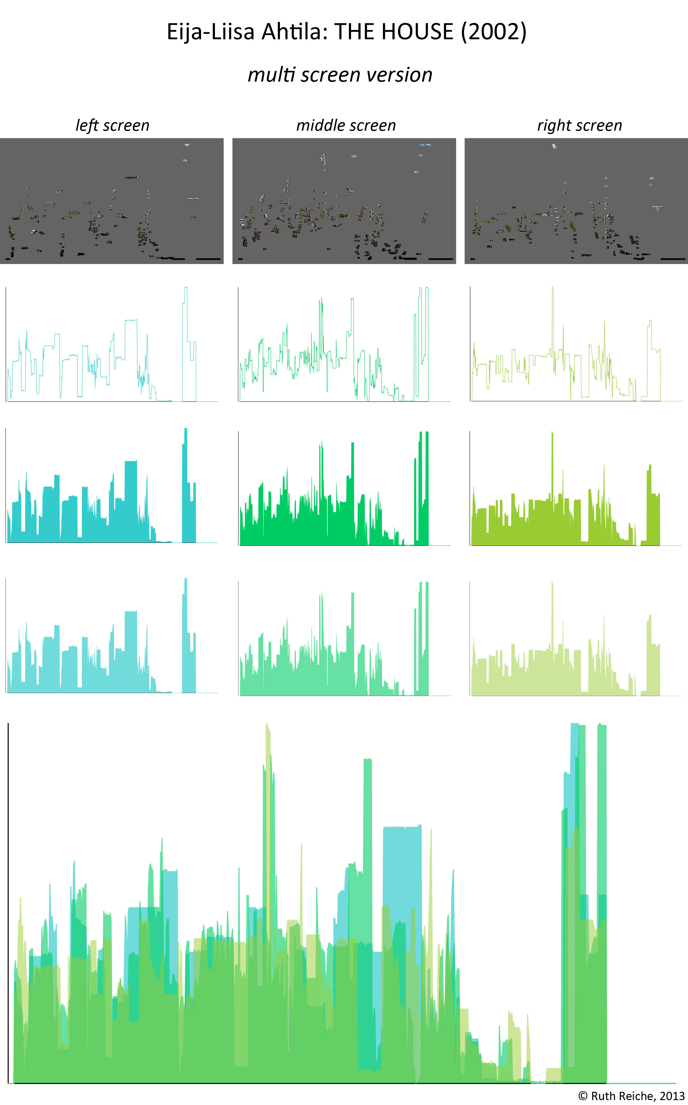
My test object for exploring ImagePlot is Eija-Liisa Ahtilas THE HOUSE (2002). It’s a 3-channel-installation I’m very familiar with. Preparing this art work for processing with ImageJ I began with extracting single frames of the film (one frame per second) and went on with dividing the split screen view of the preview DVD into three separate images. After that I had three folders (left screen, middle screen, right screen) on my desktop each containing around 900 images. By means of ImageJ’s batch mode I analyzed the median value of each image. With running ImagePlot afterwards I visualized the change of the median value over time (x-axis: time; y-axis: median value).
In the graphic below you see my results of that experiment: The first row shows the results using the standard settings of ImagePlot, the second shows the result using my own settings for making the trend curve better visible, the third shows the same but with filled curves, the fourth could be understand as a bridge to the last and final graph where the slightly transparent curves of all three screens are layered to depict the differences between them.

Schreibe einen Kommentar