Today I would like to show that visualizing results with gephi can be helpful but that not every kind of visualization algorithm implemented in gephi matters for gaining more insight. Helpfulness depends on what you would like to show! So let’s have a closer look on my use case for that!
As you may know, I write my PhD thesis about multiscreen installations. One of my favorite examples is THE HOUSE – a work of the finnish artist Eija-Liisa Ahtila that exists in two versions: a single screen version for presentation in the cinema and a multiscreen version with three projections for presentation in the gallery or museum space. Her distribution strategy opens up a lot of questions, all about what’s the difference between the two versions.
Single screen and multiscreen version have the same length (around twenty minutes). That means if you have three instead of one screen you can show three times as much. The question raises: Which of the images used in the single screen version are popping up again in the multiscreen version? And in particular: On which screen they do that?
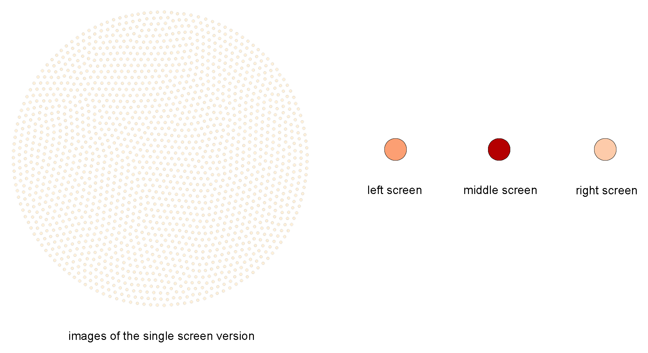
Having extracted the first scene (around one minute: 1742 frames) I came to a unique result with help of Daniel Kurzawe and his application of an automatic image recognition algorithm (that is a topic for itself – paper coming soon): Most images of the single channel version reappear on the middle screen of the multiscreen version!
Using Fruchtermann-Reingold for visualizing our result I got a visualization that shows what I would like to show:
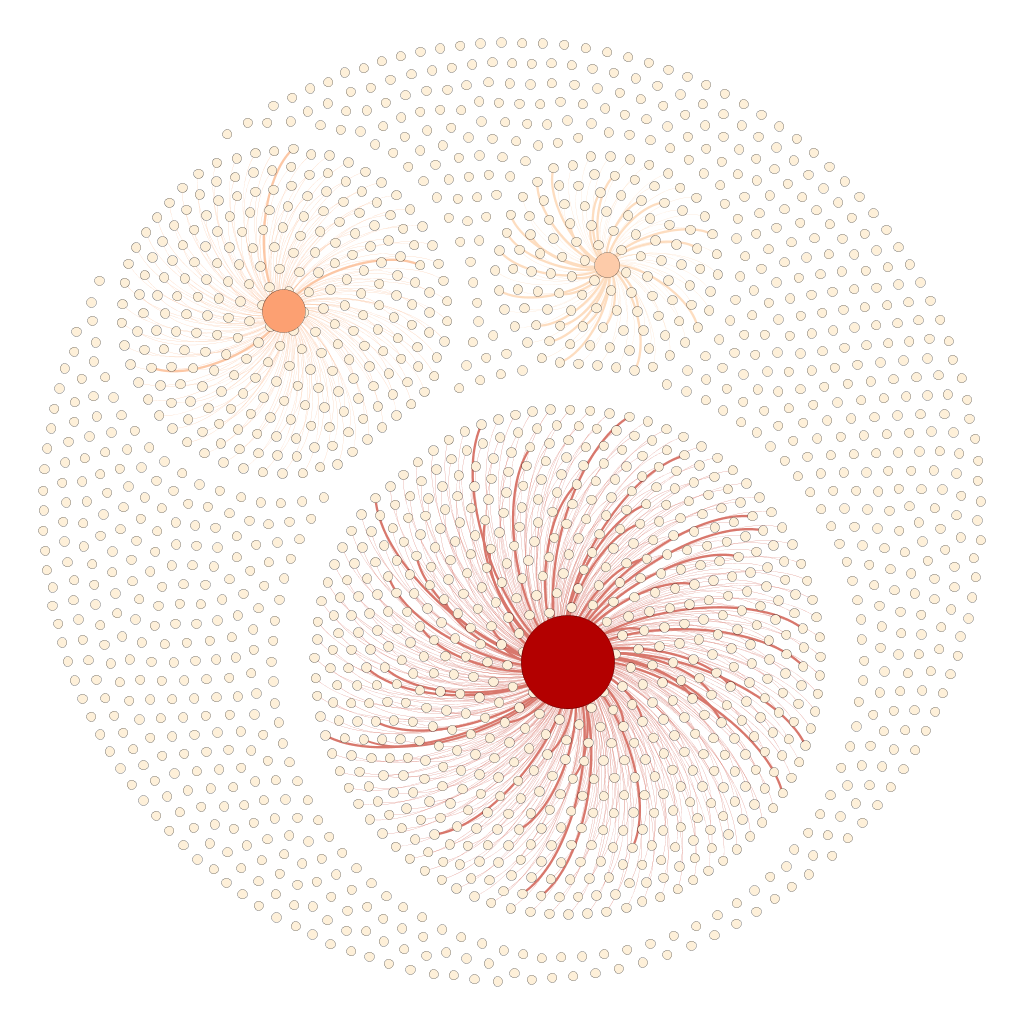 The 1742 images of the single screen version (white dots) are either connected with the left, middle or right screen node (reddish dots) or aren’t connected to anything. Left, middle and right screen node grow with the number of connecting lines. The thickness of those edges again depends on how much the images resemble to each other (that’s because of our image recognition algorithm doesn’t say similiar/not similiar but gives a degree of similiartiy).
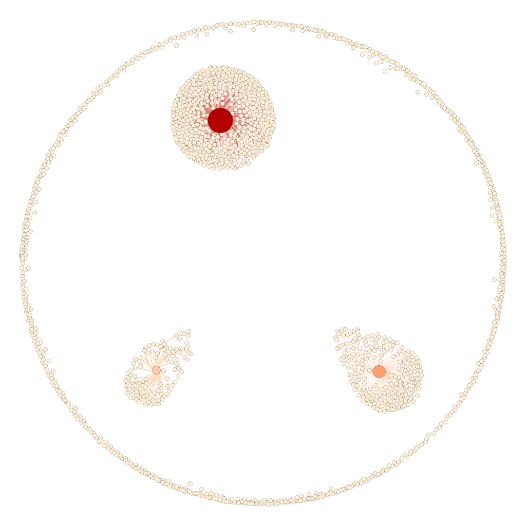
In another way also YifanHu shows the dispersion but for my flavor it is too remindful of a bacteria culture in a petri dish:
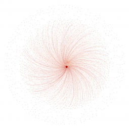
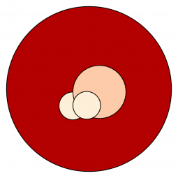
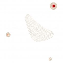
And last but not least some other visualizations I generated with gephi that are beautiful in a special sense but don’t own explanatory power because details got lost or their alignment seems too random:

