Veröffentlicht am 2 Kommentare

Visualizing Cutting Patterns

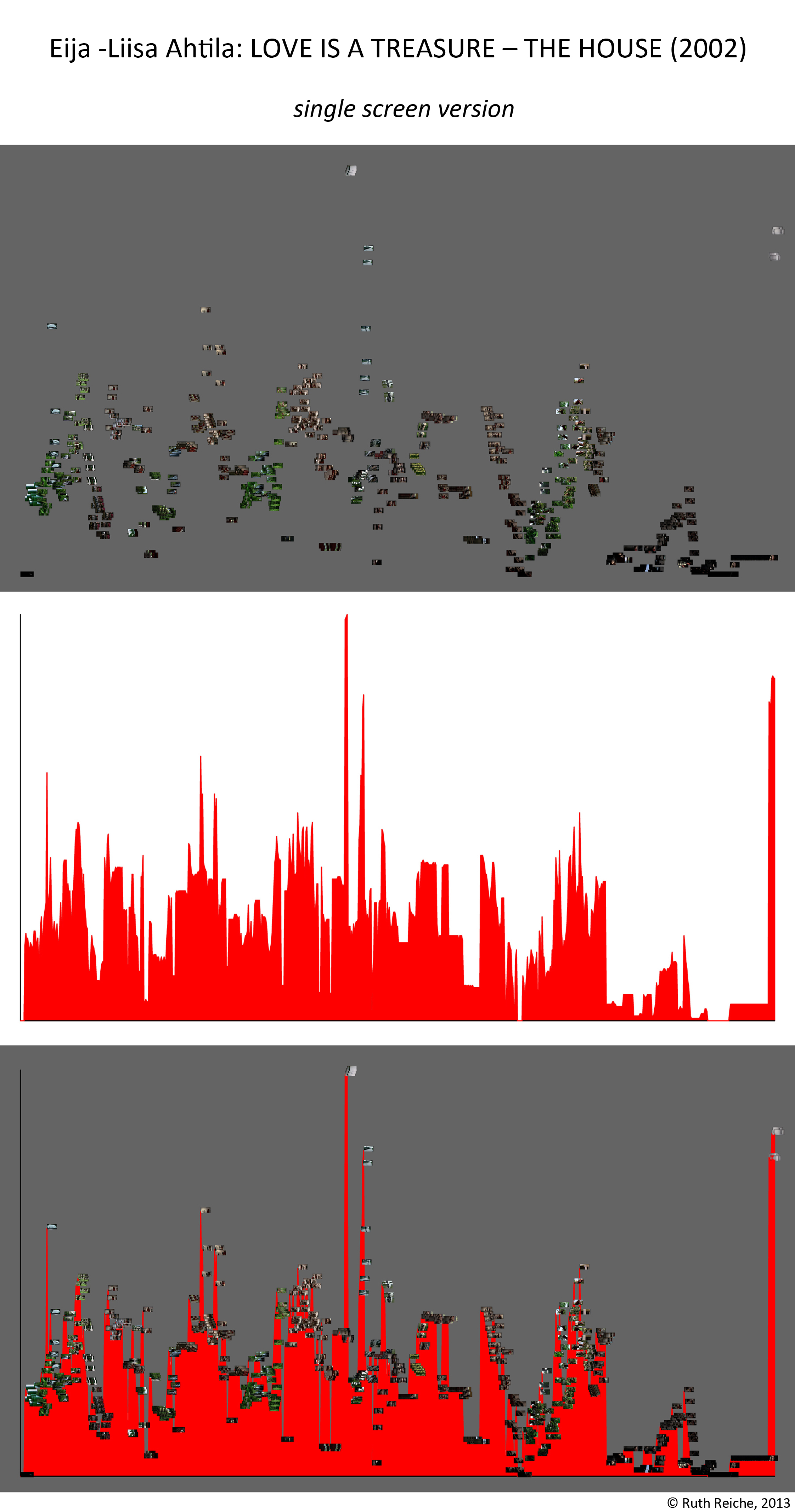
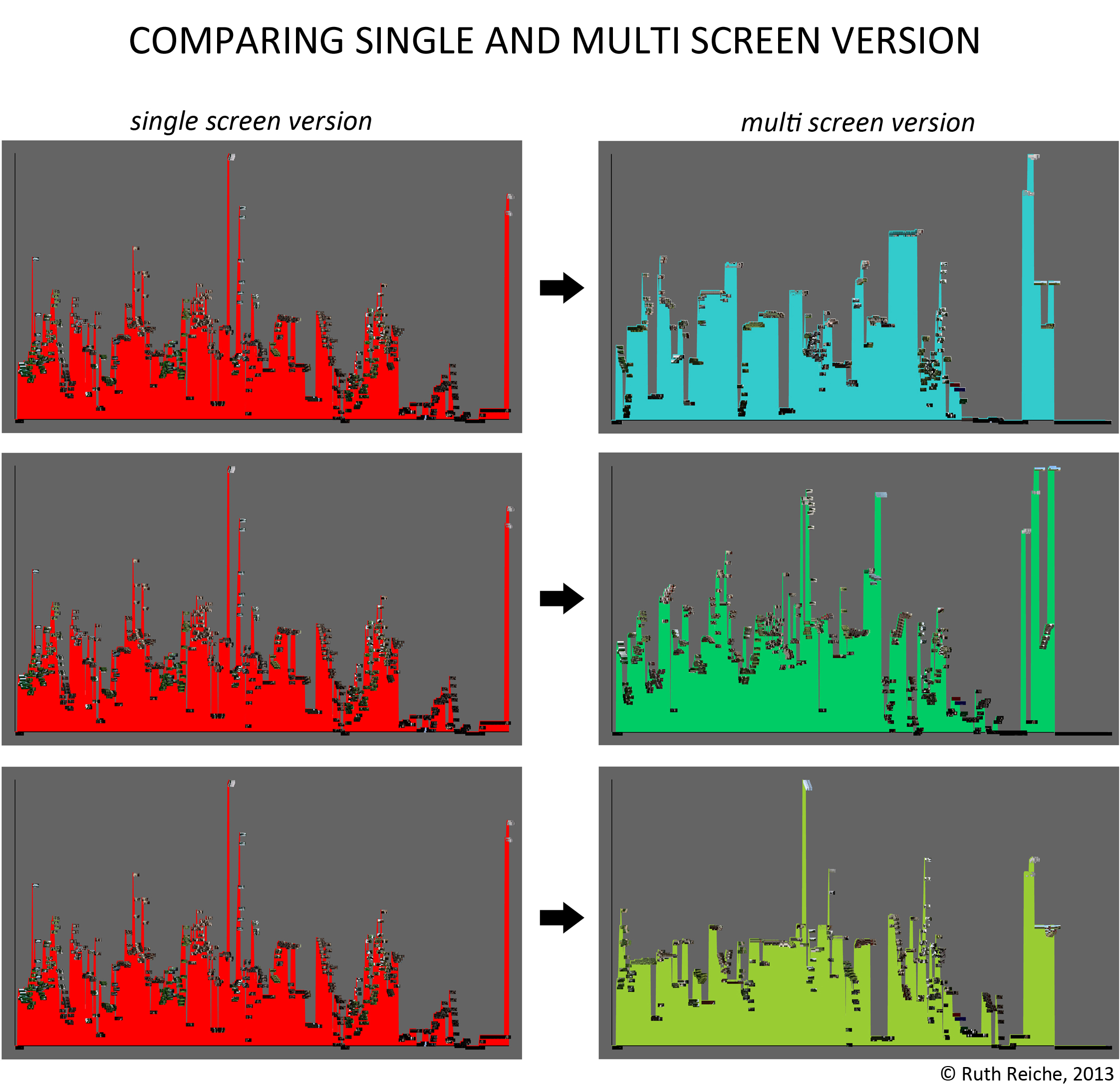
Visualizations help people to understand complex interrelations. In two of my formerly blog posts ImagePlot: Plotting Ahtila und Plotting Ahtila (… the story continues) I showed – using ImagePlot – that the finnish artist Eija-Liisa Ahtila who produced different versions of her film THE HOUSE (2002) to explore the differences between single-screen film and multi-channel installation put most of the single-screen-material to the middle screen of the 3-channel-version. Now I would like to show another way achieving that result.

In a first step I built cutting patterns of both versions. In a second step I highlighted all shots showing Elisa, the female protagonist of THE HOUSE, and all shots which are static (that means there isn’t any activity): the first ones red, the second ones blue; white coloured shots don’t show neither Elisa nor are they static. As a result you see the following at a glance: In the 1-channel-version are a lot of shots that show Elisa and only some shots which are static, in the 3-channel-version are a lot of static shots on the left and right screen; shots that show Elisa exist mostly in the middle screen – an important outcome for understanding the steering of the beholder’s view!

1-Kanal

3-Kanal

Legende

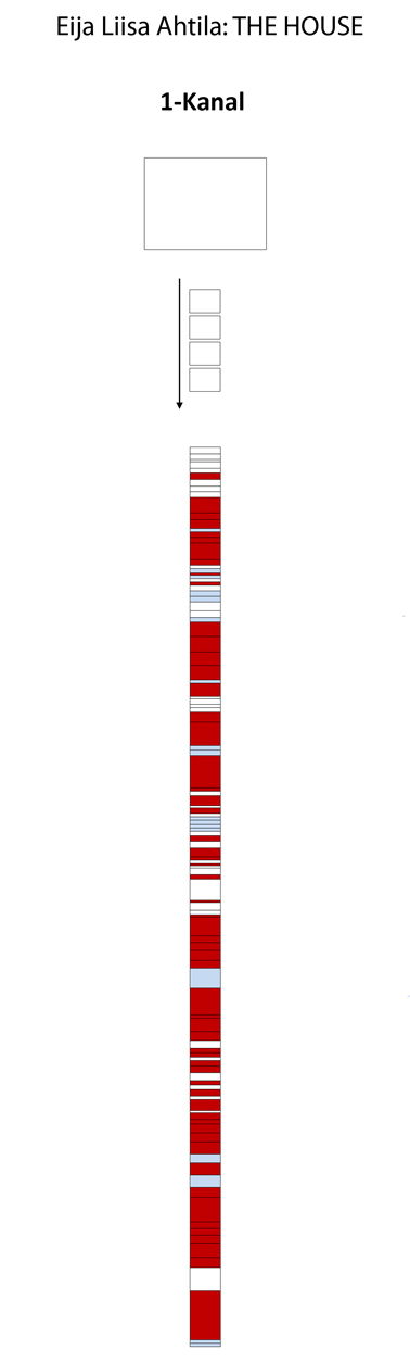
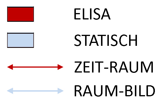
The red and blue arrows I placed in my visualization of the 3-channel-version stand for specific interrelations between shots of the left, middle and right screen which I call Zeit-Räume and Raum-Bilder. But more about that you’ll read in my PhD thesis.

Veröffentlicht am Schreib einen Kommentar

Tagung: Euphorie und Angst

Das digitale Bild und die Veränderungen, die mit einem Wandel vom Analogen zum Digitalen einhergehen, lösen in der Kunstgeschichte und verwandten Disziplinen unterschiedlichste Reaktionen aus, die zwischen Euphorie und Angst schwanken. Diesen Reaktionen und dem Spezifischen des digitalen Bildes geht die von Harald Klinke und Lars Stamm organisierte Tagung Euphorie und Angst. Reaktionen auf neue Bildmedien im digitalen Zeitalter nach. Ich werde hier über digitale Methoden und deren Potential für die Kunstwissenschaft sprechen und freue mich schon auf den regen Austausch mit Fachkollegen.

Tagung_Digitalbild_Goettingen

Veröffentlicht am Schreib einen Kommentar

Plotting Ahtila (the story continues)

In my last blog post I described how I explored Eija-Liisa Ahtilas 3-channel-installation THE HOUSE (2002) with ImagePlot (please see below). Ahtila is one of the artists who act not only in the art world but also in the screenland. That’s why she often produces more than one version from the same material, one multi screen version for displaying in the gallery or museum space, one single screen version for presenting in cinema. I’m sure you know I would like to get at – there’s not only a multi screen installation of THE HOUSE but also a single screen version, embedded in her portmanteau film LOVE IS A TREASURE (2002). For a better understanding of the particular potential of both presentation modes it would be interesting in which way both versions resemble each other and in which manner they differ.

Continuing my experimentation with ImagePlot, I did the same analyzes with the single screen version of THE HOUSE as I did with the single screen version before. You see the results below: The first picture shows the change of the median value (y-axis) over the film’s length (x-axis), the second shows the filled curve and the third combines both views (for this ‚combined plot‘ I manipulated the images with an image editor software).

IMAGEPLOT_INFOGRAFIK_The House_1-Kanal_klein

For comparing both versions I opposed the ‚combined plot‘ of the single screen version with the ‚combined plots‘ of the multiscreen version. In the first row of the graphic below you see the single screen version compared to the left screen of the multi screen version, in the second row you see the same compared to the middle screen and in the third compared to the right screen.

Plotting Ahtila - THE HOUSE - Comparing single and multi screen

What information can you get out of this? For me it seems that the middle screen of the multi screen version is the most similar to the single screen version. So this investigation by means of ImagePlot accounts for curator Doris Krystof’s opinion that the middle screen seems to show the main storyline:

Dabei nimmt das Bild in der Mitte insofern eine Sonderstellung ein, als man dort den Haupterzählungsstrang auszumachen meint.

– Doris Krystof (Bestandskatalog K21 Düsseldorf, Köln 2005, S. 28)